07/13/26
June 04, 2007
London unveils logo of 2012 Games: and immediately inspires derision and naughty thoughts!
![]() posted by billsaysthis to other at 03:06 PM - 42 comments
posted by billsaysthis to other at 03:06 PM - 42 comments
I think the logo is stimulating.
![]() posted by tommybiden at 03:31 PM on June 04, 2007
posted by tommybiden at 03:31 PM on June 04, 2007
Over at Metafilter, it was mentioned that this was a stylized 2012. I said it over there and I'll say it again here, but it looks like Colorforms to me.
![]() posted by Joey Michaels at 03:42 PM on June 04, 2007
posted by Joey Michaels at 03:42 PM on June 04, 2007
I tried looking at it as "2012" per Joey's comment, but that's still a stretch. In other news, that logo is rather, erm, self-stimulating.
![]() posted by worldcup2002 at 03:51 PM on June 04, 2007
posted by worldcup2002 at 03:51 PM on June 04, 2007
This just in: The Artist Formerly Known As Prince would like his logo back. (and now I suddenly want a cigarette)
![]() posted by THX-1138 at 03:57 PM on June 04, 2007
posted by THX-1138 at 03:57 PM on June 04, 2007
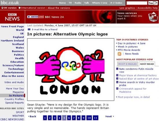
My favorite of all the alternative logos linked in the posted article. The alternatives left a little something to be desired, but they didn't cost 400,000 quid to develop either.
![]() posted by worldcup2002 at 03:59 PM on June 04, 2007
posted by worldcup2002 at 03:59 PM on June 04, 2007
Someone give The Coast of Yemen (b3ta.com) a medal.
![]() posted by salmacis at 04:04 PM on June 04, 2007
posted by salmacis at 04:04 PM on June 04, 2007
It never ceases to amaze me how much money and thought goes into all this crap, which turns out to be, well, crap. Olympic mascots and designs and official logos, and they nearly always look like they've been designed by a third grade class at St. Mary's School for the Blind and Habitually Untalented.
![]() posted by The_Black_Hand at 04:12 PM on June 04, 2007
posted by The_Black_Hand at 04:12 PM on June 04, 2007
It's final - I'm marketing myself as a graphics artist from here on. That looks like "The Simpsons" version of "Rock'Em Sock'Em Robots."
![]() posted by The Crafty Sousepaw at 04:25 PM on June 04, 2007
posted by The Crafty Sousepaw at 04:25 PM on June 04, 2007
Hey,you guys chill out; any idea how many thou and sleepless nights went into this? 400,000 pounds ain't chickenfeed.
![]() posted by sickleguy at 04:46 PM on June 04, 2007
posted by sickleguy at 04:46 PM on June 04, 2007
It's awful. I am not surprised. It's worse when it's moving too - the digital media version that rolls through several shocking bright colours and wobbles alarmingly is horrendous. At least in its static format it doesn't make your eyes bleed. When it first came out I looked and though "Ok, it says 2012 and it sorta looks like a lion. The "0" is the mane, the first 2 the tail and the second 2 the front legs... I see what you did there!" Except I don't done see what they did there, because that wasn't what they thought they were doing.
![]() posted by Mr Bismarck at 04:52 PM on June 04, 2007
posted by Mr Bismarck at 04:52 PM on June 04, 2007
The closing of the ranks from the higher-ups and the screaming defensiveness of their justifications for the logo are telling. "Thou doth protest too much", it would seem... Lord Sebastian Coe (former long-distance Olympian great and 2012 organizing head): "It will define the venues we build and the Games we hold and act as a reminder of our promise to use the Olympic spirit to inspire everyone and reach out to young people around the world. ... It is an invitation to take part and be involved." -- I'm not sure you want the kids to be involved in that (see animations). But they might. "It's not a logo, it's a brand that will take us forward for the next five years," -- It's not a bug, it's a feature. "It won't be to be eveybody's taste immediately but it's a brand that we genuinely believe can be a hard working brand which builds on pretty much everything we said in Singapore about reaching out and engaging young people, which is where our challenge is over the next five years. ... If we don't (sic) that, then frankly the whole project is unsustainable." -- You want your poor ugly child to work hard now? The last sentence, well, you said it. Prime Minister Tony Blair: "When people see the new brand, we want them to be inspired to make a positive change in their life. -- I'm not sure that's the kind of change you're looking for, but I'm sure many people find those logos (see animations) positive. "Each edition of the Olympic Games brings its own flavour and touch to what is now well over a century of modern Olympic history; the brand launched today by London 2012 is, I believe, an early indication of the dynamism, modernity and inclusiveness with which London 2012 will leave its Olympic mark." -- Oh, it will leave its mark, all right. Nice job backing up Sebby on the "brand" thing, btw. Olympics Minister Tessa Jowell: "This is an iconic brand that sums up what London 2012 is all about - an inclusive, welcoming and diverse Games that involves the whole country. ... It takes our values to the world beyond our shores, acting both as an invitation and an inspiration. -- These are not the values you are looking for. (see animations) But they are an inspiration. "This is not just a marketing logo, but a symbol that will become familiar, instantly recognisable and associated with our Games in so many ways during the next five years." -- I thought Sebby said it wasn't a logo. Get your story straight, folks. British Paralympic Association chief executive Phil Lane: "We hope that the brand will succeed in inspiring Britain's youth and Paralympic athletes to success." -- Or it might add insult to injury? London Mayor Ken Livingstone: "The new Olympic brand draws on what London has become - the world's most forward-looking and international city. -- And now your city hates you, Lord Mayor. OK, OK, enough taking the mickey. This has got to be the most cryptic, if not the worst or most amateurish logo in Olympic history I've ever seen. Anyone have a link to past logos or just the egregious ones for comparison?
![]() posted by worldcup2002 at 06:04 PM on June 04, 2007
posted by worldcup2002 at 06:04 PM on June 04, 2007
YouTube coverage of BBC's logo coverage, featuring 2012 Goatse! This is what happens when you design by committee, people.
![]() posted by insomnyuk at 07:27 PM on June 04, 2007
posted by insomnyuk at 07:27 PM on June 04, 2007
I think this mock up sums it up best (courtesy of some nameless site).
![]() posted by mkn at 07:28 PM on June 04, 2007
posted by mkn at 07:28 PM on June 04, 2007
Anyone have a link to past logos or just the egregious ones for comparison? Here's a page of Olympic logos through 2004. London's logo fares better when you compare it to what came before, which includes a lot of boring designs, but it may be the most simplistic and least representative since this one from Munich 1972:  It's weird they rejected anything that's remotely representative of the UK's rich heritage. But I think this logo will grow on people. Even in the UK, where a love of garish design is demonstrated by the football kits worn by millions.
![]() posted by rcade at 07:53 PM on June 04, 2007
posted by rcade at 07:53 PM on June 04, 2007
rcade: I'd argue that the Munich one at least has some visual coherence, all meaning aside. The London one looks like someone threw some tangram (or Colorform) pieces together, and stuck the rings and "london" in some cheapass lowercase font on them.
![]() posted by worldcup2002 at 10:09 PM on June 04, 2007
posted by worldcup2002 at 10:09 PM on June 04, 2007
I thought nobody else had ever heard of St. Mary's School for the Blind and Habitually Untalented before. It was a long, long time ago I was a different boy then. My parents made me go there as an exchange student for a whole 2 years. That was my punishment just for walking around with a cane and dark glasses. Aaah the memories......it wasn't all that bad unless it was your turn to clean the urinals.
![]() posted by jojomfd1 at 12:13 AM on June 05, 2007
posted by jojomfd1 at 12:13 AM on June 05, 2007
That Munich one makes my eyes go all zooey. And it sort of looks like a target. Which is unfortunate.
![]() posted by yerfatma at 06:18 AM on June 05, 2007
posted by yerfatma at 06:18 AM on June 05, 2007
I was all ready to defend the process and how clients often times don't go with the strongest candidates. How a project of this magnitude (400,000 GBP) will have hundreds of potential directions and the strongest ones often never make the preliminary cuts. Then I checked out the agency's website. Let's just say they're happy to explain how much thought and process went into this (I'd provide a link, or even copy the text but their crap ass flash site doesn't allow for such advanced maneuvers - you'll have to click client stories > london 2012 > action - then not move your mouse to actually read it...brilliant really). Having read through it, it contains the typical "brand" drivel that makes me repeatedly throw up in my mouth. They're so proud of themselves they'll definitely go down with the ship defending it. Way to test the waters first folks. I need an antacid now.
![]() posted by YukonGold at 07:38 AM on June 05, 2007
posted by YukonGold at 07:38 AM on June 05, 2007
This thing looks like it was just "thought" to death: Meaning on top of meaning, on top of reference on top of.... Hey, after 17 committees and 8 months, I bet it'd start to look good to me too. Of course, I'd be wrong.
![]() posted by WeedyMcSmokey at 09:32 AM on June 05, 2007
posted by WeedyMcSmokey at 09:32 AM on June 05, 2007
I like it. I can see the 20 on top and the 12 on the bottom. Then you throw in 2012 in the 0 and London in the first 2 and there you go.
![]() posted by skydivemom at 03:10 PM on June 05, 2007
posted by skydivemom at 03:10 PM on June 05, 2007
i'm having a "why the fuck did i bother going to college" moment.
![]() posted by goddam at 04:03 PM on June 05, 2007
posted by goddam at 04:03 PM on June 05, 2007
Access to cheap pharmaceuticals.
![]() posted by yerfatma at 05:46 PM on June 05, 2007
posted by yerfatma at 05:46 PM on June 05, 2007
To finally memorize your social security number?
![]() posted by YukonGold at 06:44 PM on June 05, 2007
posted by YukonGold at 06:44 PM on June 05, 2007
Now just tell me your mom's maiden name and we're done here.
![]() posted by yerfatma at 07:38 PM on June 05, 2007
posted by yerfatma at 07:38 PM on June 05, 2007
According to my mom, "I'm not your maiden your arms and legs aren't broken." That's what she says when she picks up my clothes, anyway. I'm still trying to figure out how she gets into my apartment. At 6:30 in the morning.
![]() posted by The Crafty Sousepaw at 08:58 PM on June 05, 2007
posted by The Crafty Sousepaw at 08:58 PM on June 05, 2007
According to my mom, "I'm not your maiden your arms and legs aren't broken." That's what she says when she picks up my clothes, anyway. I'm still trying to figure out how she gets into my apartment. At 6:30 in the morning. Your moms' basement is not actually an apartment.
![]() posted by tommybiden at 09:34 PM on June 05, 2007
posted by tommybiden at 09:34 PM on June 05, 2007
Now that's an, "Oh, Snap!" if I've ever read one.
![]() posted by MrFrisby at 10:03 PM on June 05, 2007
posted by MrFrisby at 10:03 PM on June 05, 2007
um, yeah, let me clarify. why the fuck did i bother going to college and study graphic design only to find myself 10 years later in the glamorous world of prepaid calling cards, while i'm convinced that this pile of steaming shit was done by the same people in my class that would habitually use Tekton and Comic Sans. i'm not claiming that i could necessarily do better, but i know plenty of people who can. it's a fucking disgrace to good design.
![]() posted by goddam at 10:46 PM on June 05, 2007
posted by goddam at 10:46 PM on June 05, 2007
I'm sorry, goddam, but 'a fucking disgrace to good design' has been rebranded. You have to call it 'challenging.'
![]() posted by Mr Bismarck at 01:22 AM on June 06, 2007
posted by Mr Bismarck at 01:22 AM on June 06, 2007
Holy crap, you work with prepaid calling cards? Why the fuck did I go to college, anyway?
![]() posted by The_Black_Hand at 04:09 AM on June 06, 2007
posted by The_Black_Hand at 04:09 AM on June 06, 2007
And, it just gets worse...the new Olympic logo causes epileptic seizures.
![]() posted by The_Black_Hand at 05:17 AM on June 06, 2007
posted by The_Black_Hand at 05:17 AM on June 06, 2007
it's a fucking disgrace to good design. I prefer to look at it as a glimmer of hope. Maybe someday I'll get paid close to a million dollars to do something that really doesn't need to be that good. With a cool mil I can hire the first writer who responds from a craigslist ad to write the "brand" spin.
![]() posted by YukonGold at 07:11 AM on June 06, 2007
posted by YukonGold at 07:11 AM on June 06, 2007
Alive with pleasure! That's all I'd need. Brilliant!
![]() posted by YukonGold at 08:26 AM on June 06, 2007
posted by YukonGold at 08:26 AM on June 06, 2007
Go with this guy. Dad?
![]() posted by wfrazerjr at 08:49 AM on June 06, 2007
posted by wfrazerjr at 08:49 AM on June 06, 2007
TBH beat me to the epileptic seizure article. Well, this sure has some qualities that appeal to the young people. I think Pokemon TV shows, when they first came out, had the same, erm, qualities, too.
![]() posted by worldcup2002 at 09:21 AM on June 06, 2007
posted by worldcup2002 at 09:21 AM on June 06, 2007
Dang, that's two spectacular mullets I've seen in the past week! This site rules! MulletFilter!
![]() posted by The_Black_Hand at 09:40 AM on June 06, 2007
posted by The_Black_Hand at 09:40 AM on June 06, 2007
So anybody with a Mac in their office can call themselves a graphic designer?
![]() posted by Newbie Walker at 04:14 PM on June 06, 2007
posted by Newbie Walker at 04:14 PM on June 06, 2007
Anyone with a mac could probably call themselves a cardiologist if they were so inclined.
![]() posted by YukonGold at 06:58 AM on June 07, 2007
posted by YukonGold at 06:58 AM on June 07, 2007
omg, I can't make out what the logo stands for. But those piss-takes are hilarious.