06/08/26
September 06, 2007
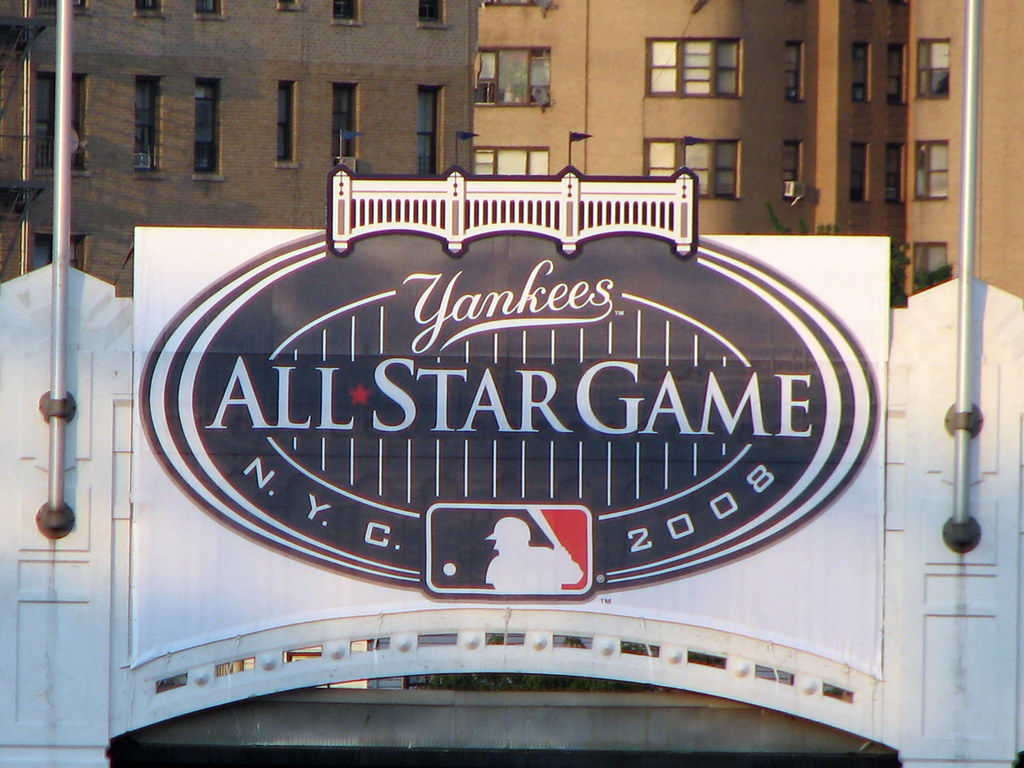
"Your all-star game logo, for the final, wonderful year of Yankee Stadium, sucks.":
![]() posted by kirkaracha to baseball at 05:12 PM - 18 comments
posted by kirkaracha to baseball at 05:12 PM - 18 comments
I also notice that 2004 was the last year that a team name or city was incorportated in the logo. Now they just have the team colors. Anybody know what's up with that?
![]() posted by NoMich at 05:19 PM on September 06, 2007
posted by NoMich at 05:19 PM on September 06, 2007
Mitch N.Y.C is in the logo.
![]() posted by shaykeno at 05:51 PM on September 06, 2007
posted by shaykeno at 05:51 PM on September 06, 2007
OK, what am I missing here? What, pray tell exactly, is the beef? It's not as if the numbers and letters are engaged in romantic congress.
![]() posted by THX-1138 at 05:58 PM on September 06, 2007
posted by THX-1138 at 05:58 PM on September 06, 2007
I also notice that 2004 was the last year that a team name or city was incorportated in the logo. I guess it says something that you didn't catch the "N.Y.C." at the bottom of the logo. I'm afraid I'm going to have disqualify any opinion on graphic design that appears on a website that looks that crappy. Bunch of design snobs, sitting around bitching ad nauseum about font selection, in Arial. Blah blah blah blah blah. I was really hoping the article would at least be funnier. The logo is fine. Maybe not an award winner, but it could be a lot worse. It's a sight better than that ridiculous Olympic disaster. And it actually looks pretty cool sitting on the actual facade at the Stadium. The only glaring error, in my opinion, is the red font, which is so bad you almost don't even notice it. Ah well. I hope this at least works out as a launching pad for Yankee bashing as well as it did in the comments below the article. Can't wait.
![]() posted by The Crafty Sousepaw at 06:11 PM on September 06, 2007
posted by The Crafty Sousepaw at 06:11 PM on September 06, 2007
Stupid Yankees, see what they did. How's that?
![]() posted by tahoemoj at 06:13 PM on September 06, 2007
posted by tahoemoj at 06:13 PM on September 06, 2007
I also notice that 2004 was the last year that a team name or city was incorportated in the logo what shaykeno and crafty said. there's also a version up at the Stadium with the Yankees script logo on it instead of "Major League Baseball" sure, there's a lot you can pick apart about the logo. but i found it to be a nice change of pace from some of the busier ones of recent years (like Pittsburgh in 2006). i'm just curious to see how it's going to translate into a patch. some of the thinner lines may get lost when embroidered.
![]() posted by goddam at 06:16 PM on September 06, 2007
posted by goddam at 06:16 PM on September 06, 2007
there's also a version up at the Stadium with the Yankees script logo on it instead of "Major League Baseball" Thank you. I stared at that logo wondering why I couldn't remember the red text. It is so much better with the Yankees script.
![]() posted by The Crafty Sousepaw at 06:21 PM on September 06, 2007
posted by The Crafty Sousepaw at 06:21 PM on September 06, 2007
The 2007 one is very nice. The 2005 one linked in the comments is hideous. The Detroit Tigers font shouldn't be mixed with anything.
![]() posted by Smackfu at 07:01 PM on September 06, 2007
posted by Smackfu at 07:01 PM on September 06, 2007
Weird that I didn't see the NYC in the Yankee's All-Star logo. I wonder why the previous three didn't put their city/team name in their All-Star logo. And thanks for the correction.
![]() posted by NoMich at 07:09 PM on September 06, 2007
posted by NoMich at 07:09 PM on September 06, 2007
I personally like the 2005 one but I may be a bit biased. The 2006 one looks horrid though.
![]() posted by Ying Yang Mafia at 07:26 PM on September 06, 2007
posted by Ying Yang Mafia at 07:26 PM on September 06, 2007
I don't think the logo is that bad. It's simpler than the others, but it doesn't make it better or worse. I'd have to see it on the patch. The smaller details may be lost.
![]() posted by jerseygirl at 07:29 PM on September 06, 2007
posted by jerseygirl at 07:29 PM on September 06, 2007
Sorry if I appeared to pile on, NoMich. My comment that "it says something" was meant to reflect on the design, not you.
![]() posted by The Crafty Sousepaw at 08:35 PM on September 06, 2007
posted by The Crafty Sousepaw at 08:35 PM on September 06, 2007
I think it looks nice. Simple and classy. The only thing I don't like is that it says N.Y.C. instead of New York. That would've fit just fine. Why abbreviate?
![]() posted by Bernreuther at 12:05 AM on September 07, 2007
posted by Bernreuther at 12:05 AM on September 07, 2007
I hope this at least works out as a launching pad for Yankee bashing as well as it did in the comments below the article. Oh, please. Oversensitivity just doesn't wear well on Yankee fans. As for the logo, it's about what I would expect from one of MLB's most storied franchises: no gimmicky crap, just simple, straightforward, and clean. I have absolutely no problem with it.
![]() posted by The_Black_Hand at 05:17 AM on September 07, 2007
posted by The_Black_Hand at 05:17 AM on September 07, 2007
I'd say it's one of the best looking ones they have had. Very classy, unlike the Rollie Fingers moustachioed Reds mascot from '53 or the '59 Los Angeles logo with a sombrero on top of a baseball or the Cleveland Indians logos with caricatured Native Americans. '84 to '90 was definitely a bad period for the logo while '06 has to take the booby prize.
![]() posted by Ricardo at 07:34 AM on September 07, 2007
posted by Ricardo at 07:34 AM on September 07, 2007
Alright, I'll be the party pooper that says compared to the previous logo the NYY one is stilted and boring and corporate. Fitting but not attractive.
![]() posted by yerfatma at 10:08 AM on September 07, 2007
posted by yerfatma at 10:08 AM on September 07, 2007
If you care about a logo that lasts one year, your life is harder than mine.
![]() posted by Slaptastic at 03:50 PM on September 07, 2007
posted by Slaptastic at 03:50 PM on September 07, 2007
I'm distressed that using a star instead of a hyphen in "All-Star" in the All-Star Game logo has apparently been a design requirement since 1992.