06/08/26
September 19, 2006
The Worst Hockey Logos of All Time: James Mirtle counts 'em down.
![]() posted by DrJohnEvans to hockey at 11:18 AM - 39 comments
posted by DrJohnEvans to hockey at 11:18 AM - 39 comments
Take out the word Sabres, insert the word Bills and you have interchangeable logos.
![]() posted by dbt302 at 11:33 AM on September 19, 2006
posted by dbt302 at 11:33 AM on September 19, 2006
I read somewhere that one of the considerations in creating a logo is how easy it is to reproduce. An example is New England Patriots' "Pat Patriot" being replaced by the "Flying Elvis". It appears that this might have been true for the new Sabres' logo. Too bad.
![]() posted by Howard_T at 12:23 PM on September 19, 2006
posted by Howard_T at 12:23 PM on September 19, 2006
I think the new uniforms would look alot better,and bring a sense of history back to the team,If they would have added the original crossed swords logo right underneath the slug. I do like the colors,and i also believe that this is the year the Sabres bring the cup to Buffalo!
![]() posted by chetehc at 12:23 PM on September 19, 2006
posted by chetehc at 12:23 PM on September 19, 2006
Good stuff Doc. To me, that Las Vegas Flash logo looks like a Pez dispenser on acid.
![]() posted by MrFrisby at 12:40 PM on September 19, 2006
posted by MrFrisby at 12:40 PM on September 19, 2006
One thing i forgot,I really think that the players number on the front of the jersy looks TERRIBLE,and serves no usefull purpose.The uniforms in my opinion,Do look real nice,BUT that number looks totaly out of place,and as far as i can tell serve no usefull purpose.
![]() posted by chetehc at 12:42 PM on September 19, 2006
posted by chetehc at 12:42 PM on September 19, 2006
I don't see how the Colorado Rockies logo even gets in that discussion. It might be garish and dated, but it doesn't have a cartoon otter dealing poker or whatever is going on in some of the others.
![]() posted by yerfatma at 12:49 PM on September 19, 2006
posted by yerfatma at 12:49 PM on September 19, 2006
And who was the brainiac behind naming the Columbus Team the "Blue Jackets". With color of Maize & Blue?
![]() posted by oh2rooper at 01:07 PM on September 19, 2006
posted by oh2rooper at 01:07 PM on September 19, 2006
The Lewiston MAINEiacs logo is so horrifically bad that it has crossed over into campy goodness. They must keep it. I don't see how the Colorado Rockies logo even gets in that discussion. Agreed. It's a great logo. Besides, it incorporates the Colorado state flag into it. Beauty. Lastly, there are a surprisingly large amount of people from Mississauga that has purchased our software. How big is that town?
![]() posted by NoMich at 01:14 PM on September 19, 2006
posted by NoMich at 01:14 PM on September 19, 2006
The Columbus Blue Jackets is a shoutout to the Civil War history of the region, and it's also some kind of stinging insect. It makes a certain amount of sense, and while the logo sucks, the rest of the jersey's design is pretty snazzy. (And am I the only one who thought the Islanders' Fisherman logo looked good? If I am, I'll make my peace with that.) The Sabres' third jersey design (the two crossed swords in a dark circle on a red uni) looked stellar. This new one is bad, but not as bad as the Bruins' jersey with the big dopey bear head floating in a vat of mustard. The worst NHL logo, though, is the Tampa Bay Lightning. It looks like a sixth-grader did it in ten minutes in WordPerfect (Win3.1) while Phil Esposito stalled the press conference in the next room. It's just amateurish, and completely unbecoming of a Stanley Cup championship team. Jeezus, guys, I respect the franchise and all, but pick a new font, at least.
![]() posted by chicobangs at 01:29 PM on September 19, 2006
posted by chicobangs at 01:29 PM on September 19, 2006
...but not as bad as the Bruins' jersey with the big dopey bear head floating in a vat of mustard. Bruins have retired this one (thank goodness) and replaced it with a retro '70s (?) jersey.
![]() posted by Howard_T at 01:49 PM on September 19, 2006
posted by Howard_T at 01:49 PM on September 19, 2006
But that Bruins jersey was an homage to one of the early unis. Except for the bright yellow. And garishness.
![]() posted by yerfatma at 02:07 PM on September 19, 2006
posted by yerfatma at 02:07 PM on September 19, 2006
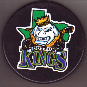
This list isn't complete without the Lubbock Cotton Kings. That's just great.
![]() posted by Bulgaroktonos at 02:58 PM on September 19, 2006
posted by Bulgaroktonos at 02:58 PM on September 19, 2006
Yeah, that's a pretty sweet logo. Looks exactly like the Tripod logo. Cool muppet mascot though.
![]() posted by NoMich at 03:13 PM on September 19, 2006
posted by NoMich at 03:13 PM on September 19, 2006
The commentary on the Inferno and the Raiders was very funny, but then... I dunno. It tailed off for me. I kind of liked the IceDogs logo. It made me think of beer for some reason. Yerfatma, dude, that's the second time in this thread you found occasion to use the word "garish." Stop. Please. As it is this thread is a little too "Project Runway."
![]() posted by BullpenPro at 03:20 PM on September 19, 2006
posted by BullpenPro at 03:20 PM on September 19, 2006
Oh, stop being so campy, BullpenPro. That's so garish of you.
![]() posted by NoMich at 03:27 PM on September 19, 2006
posted by NoMich at 03:27 PM on September 19, 2006
Excuse me - but: We want fish sticks!" How does the Gorton's fisherman not make the list?!
![]() posted by mb99fan at 03:45 PM on September 19, 2006
posted by mb99fan at 03:45 PM on September 19, 2006
Aw shit, how very declass� of me.
![]() posted by yerfatma at 04:07 PM on September 19, 2006
posted by yerfatma at 04:07 PM on September 19, 2006
For a brief period of time, I believe the El Paso "Buzzards" were called the "Cow Patties". The logo and their uniforms looked like they were made by Gateway.... Here's the only article I could find on it. The team's no longer there...go figure.
![]() posted by slackerman at 04:17 PM on September 19, 2006
posted by slackerman at 04:17 PM on September 19, 2006
Am I the only person who thought of University of Santa Cruz when looking at the Sabres new unis?
![]() posted by tommybiden at 05:23 PM on September 19, 2006
posted by tommybiden at 05:23 PM on September 19, 2006
Relax people. The changing of logos is strictly for marketing. People just HAVE to have that new logo. Expect to see a change from time to time. It brings in the $$$. They should change some of the team names starting with the Anaheim Mighty Ducks, Carolina Hurricanes, Columbus Bluejackets, etc.
![]() posted by joromu at 07:31 PM on September 19, 2006
posted by joromu at 07:31 PM on September 19, 2006
What's wrong with the Hurricanes name?
![]() posted by NoMich at 07:50 PM on September 19, 2006
posted by NoMich at 07:50 PM on September 19, 2006
The Macon Whoopee.
![]() posted by SummersEve at 07:51 PM on September 19, 2006
posted by SummersEve at 07:51 PM on September 19, 2006
The NHL team for Colorado is The Avalanche not The Rockies & yes that logo stinks. Otherwise fun site.
![]() posted by Psycho at 08:56 PM on September 19, 2006
posted by Psycho at 08:56 PM on September 19, 2006
while I can definately feel MrFrisby's pez dispenser assessment this is the first thing that I thought of The Los Vegas Chinchilla its absurd, fuzzy and maybe a little garish. Seriously funny thread Dr Evans thanks.
![]() posted by kyrilmitch_76 at 09:22 PM on September 19, 2006
posted by kyrilmitch_76 at 09:22 PM on September 19, 2006
The NHL team for Colorado is The Avalanche not The Rockies... The team that you now know as the New Jersey Devils used be located in Denver, Colorado. I'll give you three guesses as to what their name was.
![]() posted by NoMich at 09:44 PM on September 19, 2006
posted by NoMich at 09:44 PM on September 19, 2006
![]() posted by MrFrisby at 09:46 PM on September 19, 2006
posted by MrFrisby at 09:46 PM on September 19, 2006
Nope, but close. They were the Scoots. You see, they liked to eat undercooked pork. Gave 'em the scoots.
![]() posted by NoMich at 10:35 PM on September 19, 2006
posted by NoMich at 10:35 PM on September 19, 2006
Kansas City Scouts became the Colorodo Rockies became the New Jersey Devils...
![]() posted by toradio at 12:52 PM on September 20, 2006
posted by toradio at 12:52 PM on September 20, 2006
Kansas City Scouts became the Colorodo Rockies became the New Jersey Devils... And were named after Tonto's horse. At least that's what their logo would suggest.
![]() posted by Howard_T at 04:00 PM on September 20, 2006
posted by Howard_T at 04:00 PM on September 20, 2006
Relax people. They should change some of the team names starting with the Anaheim Mighty Ducks,. Umm, they did change the name, they're the Anaheim Ducks now.
![]() posted by tommybiden at 04:37 PM on September 20, 2006
posted by tommybiden at 04:37 PM on September 20, 2006
Heh, this bad logo business has gotten insane... if my site was hosted on my own server, it would have crashed a few hours ago. (And if I'd have known so many people would be reading the thing, I would have done a bit more digging for the bottom of the barrel.) The No. 1 most common email I'm getting is saying 'where's the Islanders' Captain Highliner jersey?'
![]() posted by Mirtle at 05:11 PM on September 20, 2006
posted by Mirtle at 05:11 PM on September 20, 2006
Alas, a whole league of stinkers. Hockey + southwest does not translate into good logo's, I'm afraid.
![]() posted by mjkredliner at 05:19 PM on September 20, 2006
posted by mjkredliner at 05:19 PM on September 20, 2006
Sweet merciful crap, those are awful. All of 'em. Except those old LA Kings jerseys - They're art.
![]() posted by WeedyMcSmokey at 07:54 PM on September 20, 2006
posted by WeedyMcSmokey at 07:54 PM on September 20, 2006
Hey now, the CHL is how I got into hockey in the first place (and my first opportunity to see it live, which I did quite a bit back in HS). Admittedly, the first Tulsa Oilers logo sucked a *lot*, but the 95-96 one was pretty legit, if you're aware of the Golden Driller. Beats the hell out of whatever they have now.
![]() posted by Ufez Jones at 09:30 PM on September 20, 2006
posted by Ufez Jones at 09:30 PM on September 20, 2006
I have a New Mexico Scorpions shirt somewhere. It's a total fashion don't.
![]() posted by chicobangs at 10:32 PM on September 20, 2006
posted by chicobangs at 10:32 PM on September 20, 2006
Uh, the Jackets' original logo was not by any means bad. As for the new Buffalo logo, I don't see the point. The last one was just fine, and even looked like a buffalo. the numbers on the front, I can live with, but that so-called logo sucks.
![]() posted by AvsJacket at 12:03 AM on September 21, 2006
posted by AvsJacket at 12:03 AM on September 21, 2006
The No. 1 most common email I'm getting is saying 'where's the Islanders' Captain Highliner jersey?' Heh -- I almost just posted that as a comment, except I was going to call it the "Old Man And The Sea" jersey. Except those old LA Kings jerseys - They're art. You're speaking my language, Weedy.
![]() posted by fabulon7 at 08:39 AM on September 21, 2006
posted by fabulon7 at 08:39 AM on September 21, 2006
Lastly, there are a surprisingly large amount of people from Mississauga that has purchased our software. How big is that town? Mississauga is the largest suburb of Toronto and as its own city, it is actually one of the most populated cities in Canada. Some 700k people. Still a wasteland though (I know cause I spent 16 years there). Nobody cares about the Ice Dogs though, crappy logo or otherwise. This is Leaf country.
![]() posted by mkn at 01:06 PM on September 21, 2006
posted by mkn at 01:06 PM on September 21, 2006
The new Sabres logo is horrible. It resembles a hairy, golden slug. As a Sabres fan, I love the colors. The logo, though, is a complete disaster. I'd much rather they go back to the old one from back in the day with the buffalo above the two crossed swords. I just can't believe any group of individuals put in charge of coming up with, and ultimately approving a logo change would agree with this one. Now fans are forced to go out and purchase crap with this creature on it in an effort to not feel they're behind the times. Getting rid of the black and red theme, though, was a good move because I never realized just how many NHL teams currently utilize that color scheme. It was getting really dull.