06/09/26
October 31, 2005
The NBA's ugliest Uniforms: A listing of the NBA's worst uniforms. Pretty funny actually
![]() posted by koolmo to basketball at 11:32 AM - 26 comments
posted by koolmo to basketball at 11:32 AM - 26 comments
I'm sorry, but no list of worst uniforms can ever be complete without mentioning the Dallas Mavericks silver road uniform for the 2003 season. They had to be the worst uniform for any sports team in history. I remember turning on the TV to watch the Mavericks game against the Lakers and trying to adjust my set to eliminate the shimmer and glare. The uniforms lasted that one game and were retired.
![]() posted by graymatters at 12:17 PM on October 31, 2005
posted by graymatters at 12:17 PM on October 31, 2005
Oh man, graymatters, I was laughin for days at that. Based on their list, I gotta say the Hawks '99 looked pretty slick.
![]() posted by charlatan at 12:25 PM on October 31, 2005
posted by charlatan at 12:25 PM on October 31, 2005
graymatters, it seems the the Sacramento Kings are going to make that same mistake this year. Yeesh.
![]() posted by chicobangs at 12:59 PM on October 31, 2005
posted by chicobangs at 12:59 PM on October 31, 2005
That is just horrid!
![]() posted by kingosiris at 01:18 PM on October 31, 2005
posted by kingosiris at 01:18 PM on October 31, 2005
The numbers on the Portland Trailblazers 1984 uni look a little odd to me. It looks like a reversed "22", sort of "ss." As if the gent is wearing it inside out or the photo was reversed. (I wish these lists went further back than they do. Surely some of those old school cats looked pretty slick. Or sick. Whichever. Wilt (?), Jerry , Bob and Wilt, again.)
![]() posted by Philfromhavelock at 01:44 PM on October 31, 2005
posted by Philfromhavelock at 01:44 PM on October 31, 2005
The old Pistons Jerseys were pretty foul.
![]() posted by Bill Lumbergh at 01:57 PM on October 31, 2005
posted by Bill Lumbergh at 01:57 PM on October 31, 2005
Speaking of the Mavs, their p. puffy piddy combs green alt jerseys are pretty odd. They look like something from the Women's Basketball League (Chicago Hustle, Milwaukee Does...) from 25 years ago. Not that there's anything wrong with that...
![]() posted by Brett at 02:27 PM on October 31, 2005
posted by Brett at 02:27 PM on October 31, 2005
They had to be the worst uniform for any sports team in history. Three words: Vancouver Canucks jerseys
![]() posted by grum@work at 02:30 PM on October 31, 2005
posted by grum@work at 02:30 PM on October 31, 2005
I actually like the sixers in all black.
![]() posted by Big Dookie at 02:45 PM on October 31, 2005
posted by Big Dookie at 02:45 PM on October 31, 2005
chico, don't forget that the Maloof Brothers are very, very Vegas these days.
![]() posted by billsaysthis at 03:12 PM on October 31, 2005
posted by billsaysthis at 03:12 PM on October 31, 2005
Oh yeah, bill, there's a reason they chose that gold shimmery stuff. And it'll probably look great at the ARCO, for the same reason it looks good holding up cleavage at the Bellaggio. But on TV, not so much.
![]() posted by chicobangs at 03:37 PM on October 31, 2005
posted by chicobangs at 03:37 PM on October 31, 2005
What about those chromakey uniforms the Nets wore in the late '80s/early '90s?
![]() posted by ajaffe at 03:39 PM on October 31, 2005
posted by ajaffe at 03:39 PM on October 31, 2005
(And I forgot how much the Canucks jerseys made them look like Ming the Merciless' henchmen.)
![]() posted by chicobangs at 03:39 PM on October 31, 2005
posted by chicobangs at 03:39 PM on October 31, 2005
C'mon grum - the blue and green Canucks jersey is great. However, having the best looking uniform is like being the valedictorian at summer school. Frankly, they're all damn ugly.
![]() posted by WeedyMcSmokey at 03:46 PM on October 31, 2005
posted by WeedyMcSmokey at 03:46 PM on October 31, 2005
The numbers on the Portland Trailblazers 1984 uni look a little odd to me. It looks like a reversed "22", sort of "ss." As if the gent is wearing it inside out or the photo was reversed. You are correctt, the photo is reversed. The stripes go down the left leg, not the right. See what I mean here.
![]() posted by Miles1996 at 03:48 PM on October 31, 2005
posted by Miles1996 at 03:48 PM on October 31, 2005
-Grumatwork How about the Oakland seals uniform? Horrid, horrid stuff
![]() posted by HATER 187 at 03:55 PM on October 31, 2005
posted by HATER 187 at 03:55 PM on October 31, 2005
grum: I'm actually a huge fan of the blue and green, horizontal hockey stick uniform. The other two, though, are pretty bad.
![]() posted by NoMich at 04:04 PM on October 31, 2005
posted by NoMich at 04:04 PM on October 31, 2005
None are uglier than the Cleveland Cavaliers home uni's from 1995 to 1999. With the Powder Blue Paint Splash in the front and the stupid ass logo in blue and black. There was a rumor going around in C-Town that former blind owner Gordon Gund designed the uniform, but that was never proven. Anyway, whoever designed those pieces of trash should have been beaten with a tire iron.
![]() posted by ArtVandalay420 at 04:29 PM on October 31, 2005
posted by ArtVandalay420 at 04:29 PM on October 31, 2005
grum: I'm actually a huge fan of the blue and green, horizontal hockey stick uniform. The other two, though, are pretty bad. It's not as bad as the yellow monstrosities, but come on...the logo is a hockey stick on a white background? It's almost like it's the "default" logo and they forgot to change it before sending it to the jersey-makers. The only somewhat redeeming feature is that it forms the letter "C", for Canuck. Nowadays, the jersey looks good because it isn't as busy as the modern jerseys. That's why the Toronto, Boston and Detroit and Montreal basic hockey jerseys look so good: simplicity.
![]() posted by grum@work at 10:20 PM on October 31, 2005
posted by grum@work at 10:20 PM on October 31, 2005
Has anyone forgotten how the Houston Rockets pajama uniforms looked? I still have nightmares of Charles Barkley in those ugly things!
![]() posted by nflhou02 at 10:22 PM on October 31, 2005
posted by nflhou02 at 10:22 PM on October 31, 2005
The coolest thing about those teal Pistons' uniforms was Grant Hill (not injured).
![]() posted by saint_eagle24 at 10:26 PM on October 31, 2005
posted by saint_eagle24 at 10:26 PM on October 31, 2005
I, ummm, like the Seals' uniforms...
![]() posted by ajaffe at 07:35 AM on November 01, 2005
posted by ajaffe at 07:35 AM on November 01, 2005
"I went through my personal color inventory and put together a gaggle of tones and shades that I thought best reflected the attitude of the Mavericks. I got to the final look by putting an alternative spin on the silver element in our current color palette, giving it a fashionable, less traditional feel."Did Cuban really say that? He has a personal color inventory?
![]() posted by rcade at 12:02 PM on November 01, 2005
posted by rcade at 12:02 PM on November 01, 2005
Yer damn right he does, big sumbitch, too, with a whole gaggle of tones and shades. Maybe two gaggles, for that matter. He is an eccentric millionaire, after all, and can afford it.
![]() posted by The_Black_Hand at 09:49 PM on November 01, 2005
posted by The_Black_Hand at 09:49 PM on November 01, 2005
These are but a few of the thousands of glorious colors that make up Mark Cuban's personal color inventory. 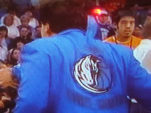
![]() posted by cl at 09:48 AM on November 03, 2005
posted by cl at 09:48 AM on November 03, 2005
They may be the suckiest bunch of sucks who ever sucked but the Knickerbockers have a great uni. What about the spurs unis they're like the b&w LA kings jerseyof the 90's real cool shit. The raptors jersey is OK if your 8 and going to wear it to elementary school.